

Is Your Home a Summer? How to Decorate with Soft, Serene Elegance

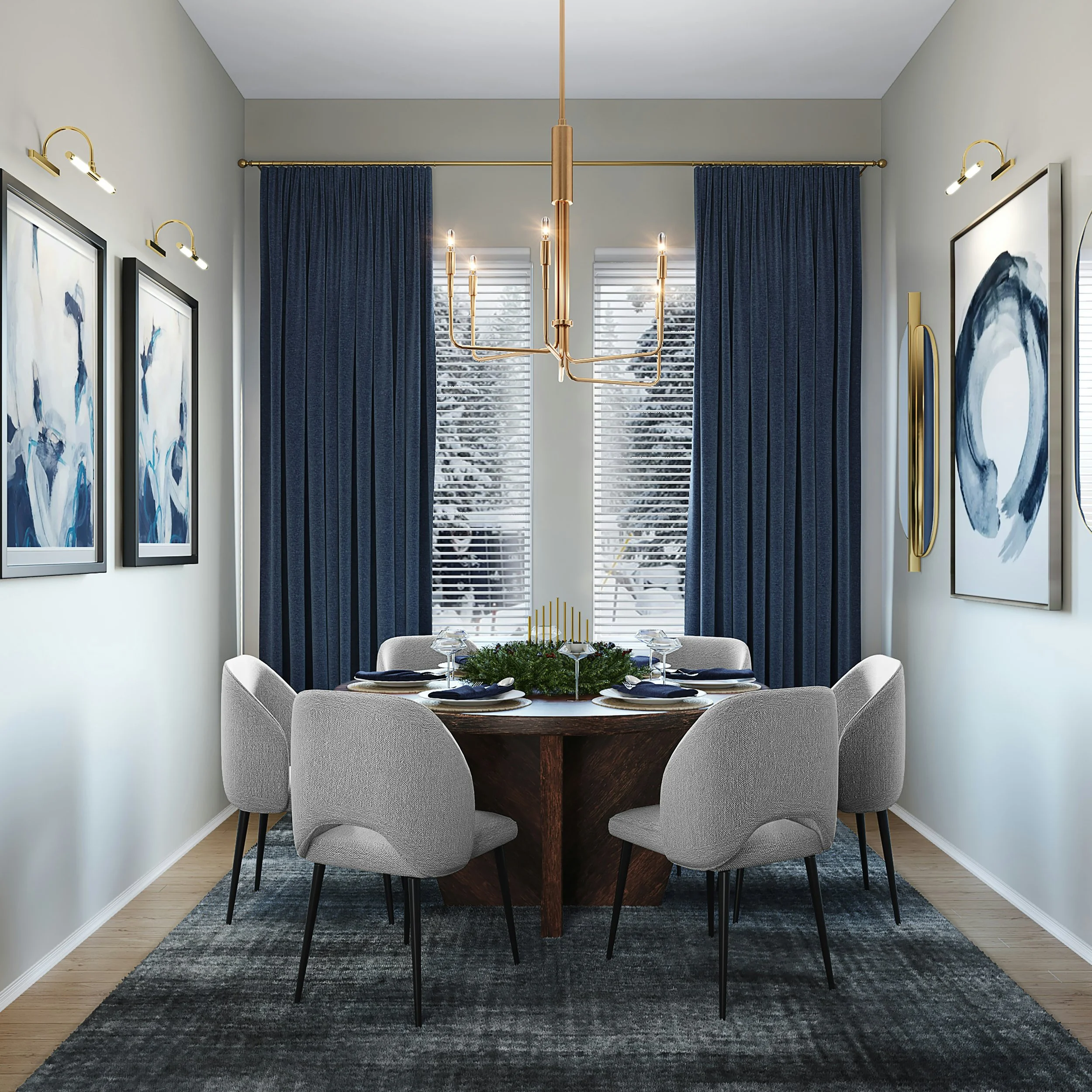
There is a particular kind of calm that settles over a room decorated in soft gray-blue walls, a medium blue sofa, and a single dusty navy throw pillow — nothing shouting for attention, everything blending into one continuous, peaceful wash of tone.
If that description makes your shoulders drop and your breathing slow just from reading it, there's a strong chance your home belongs to what seasonal color analysis calls the Summer palette, and understanding it can finally explain why certain rooms feel like a held breath while others feel like an exhale.
Why So Many Summer Homes Get Talked Out of Their Calm
This is exactly where so many Summer homeowners get stuck: they add too much warmth into their woods and finishes because they're worried the room will feel boring without it. But a true Summer home needs harmony, not warmth. The serenity is the whole point. Resist the urge to throw in a bold accent color just because you feel like something is "missing." Often, nothing is missing. The calm is the design.
Trusting the Quiet
So many women live in a home that is quietly, beautifully cool and soft — and instead of trusting it, they second-guess it. They worry a muted, low-contrast room reads as unfinished, so they reach for a bold accent color, a dramatic piece, something to make the space feel more "done." But a genuine Summer home was never designed to rely on drama to feel complete. It relies on harmony. Summer color schemes many times pair white with a single color — white and blue, white and green, and so on — and that simple formula is often the reason the room already feels effortlessly elegant, long before anyone thinks to add more.
What Makes a Home a Summer Home
Every home carries fixed elements that reveal its natural palette — features that can't easily be changed without a significant renovation. Begin with your flooring. Is it a light, cool-toned wood with a weathered or ashy quality, rather than something golden or richly saturated?
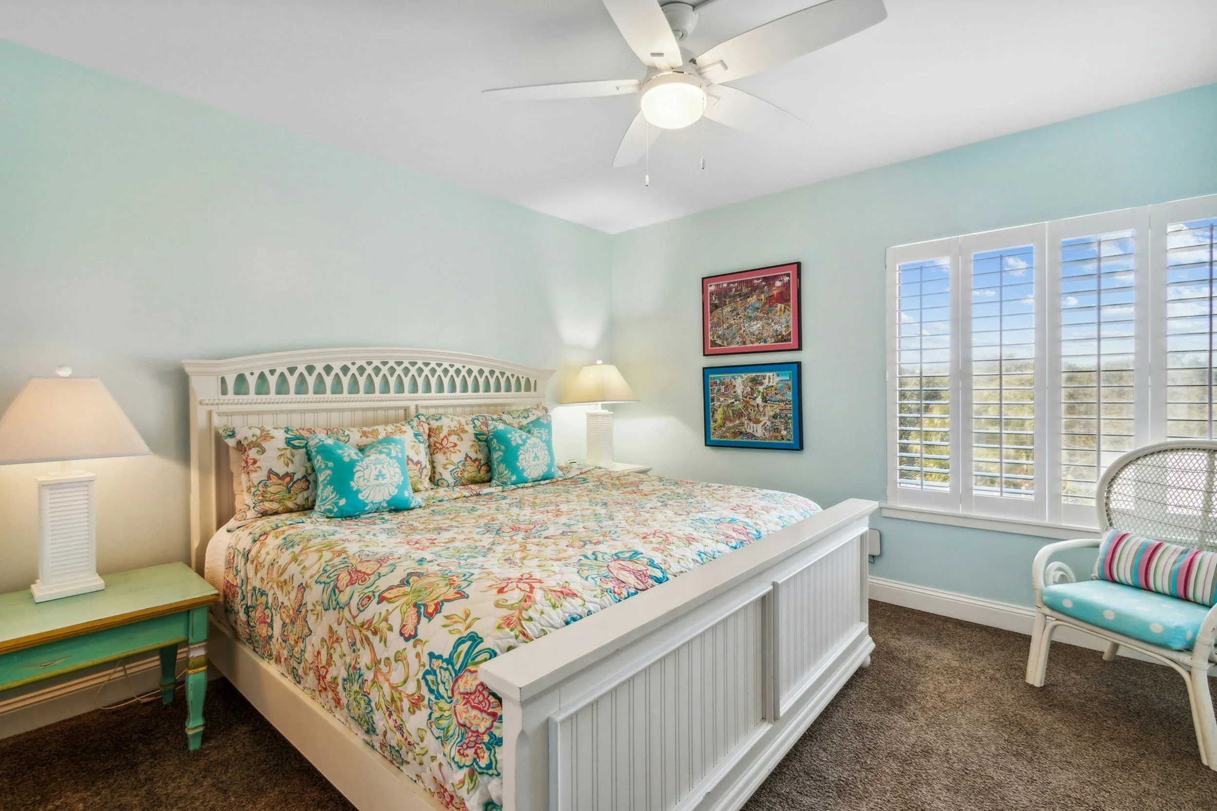
Next, consider your architecture. Summer homes often show up in coastal or transitional styles, spaces filled with soft, diffused natural light rather than harsh, direct sun. If your countertops lean cool gray and your existing finishes feel muted rather than vibrant, you are very likely looking at a Summer home.
Where a Winter home thrives on stark opposition and a Spring home celebrates vibrant multi-color contrast, a Summer home operates on an entirely different principle: low contrast and tonal harmony. Instead of pairing opposites, you layer different shades within the same cool, muted color family. Picture a room built from light gray-blue walls, a medium blue seating piece, and a dusty navy accent pillow — three distinct pieces that read as one seamless, calming whole. This is the palette responsible for rooms that feel like an actual exhale the moment you walk in.
In a Summer home, metal finishes should be soft-shine or matte: brushed nickel, pewter, or matte silver. Avoid anything with a hard, high-shine finish, since a sharp reflective surface works against the diffused, gentle light quality that defines this palette. The goal is metal that quietly supports the room rather than metal that demands to be noticed.
If there is one area where a Summer home gets to be genuinely luxurious, it's texture. Silk, velvet, brushed cotton, and sheer linen all belong here, layered for what can only be described as effortless elegance — the kind of room that looks like no decisions were made at all, even though every single one was intentional.
Pattern in a Summer home should stay subtle: delicate, small-scale florals, soft watercolor effects, and elegant damask motifs. Bold or graphic patterns tend to disrupt the tonal harmony that defines this season. If you've ever stood in a fabric showroom and quietly gravitated toward the faint watercolor print while everyone else reached for something louder, that instinct was leading you correctly.
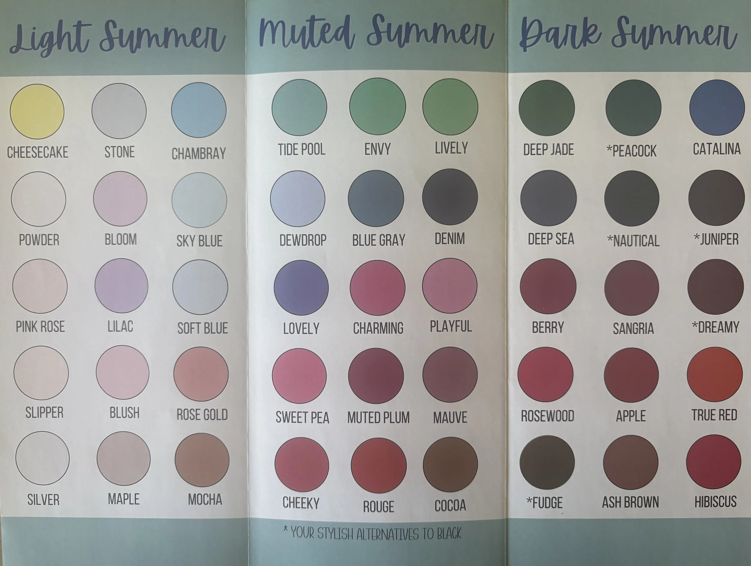
Beyond the fundamentals, Summer interior design thrives on airy, serene, nature-inspired color palettes. Top colors for the season include dusty blues, sage greens, butter yellows, and creamy whites, which capture twilight skies and coastal landscapes, paired beautifully with earthy tones and natural textures like light wood, rattan, and linen. A few palettes worth exploring: Coastal Serenity, blending misty sky blues and navy with crisp chalk white; Soft & Earthy Neutrals, built on cool greige, cream, and soft caramel; Sunlit & Cheerful, layering in butter yellow with subtle terra-cotta or shell pink; and Botanical Greens, using sage and olive tones as a neutral bridge to indoor plants and fresh florals.
A Season That Points to Rest
There's a striking parallel between the Summer palette and Psalm 23:2–3, rendered so vividly in the Passion Translation: a resting place found in luxurious love, an oasis of peace near a quiet brook, a soul that is restored and revived. That is Summer's design language translated directly into scripture — quiet waters, gentle rest, restoration rather than striving. If life has felt like anything but restful lately, if you've been moving from one demand to the next without a true moment of stillness, this verse extends more than a description of peace; it extends an invitation into it, led by the Shepherd Himself.
CONCLUSION
Letting your home reflect that kind of quiet isn't a lesser choice than a bold, dramatic space — it's simply a different and equally valid expression of beauty.
If your instincts keep pulling you toward soft blues, muted tones, and rooms that feel like a deep breath rather than a statement, trust that pull completely.
Your home already knows what kind of rest it's offering you. The next step is simply letting it.
FAQ
How do I know if my home is a Summer and not a Winter, since both are cool-toned?
The difference is contrast, not undertone. A Winter home pairs cool colors with stark, dramatic contrast — think crisp black against bright white. A Summer home stays cool but low-contrast, layering soft, muted shades of the same color family, like a light gray-blue wall with a slightly deeper dusty navy pillow. If your instinct is toward blending rather than opposing, you're likely a Summer.
I feel like my Summer room needs "something more" — how do I know if that instinct is right?
Pause before adding anything. In a true Summer home, that restless feeling is often a false alarm — the room isn't missing something; the calm itself is doing exactly what it was designed to do. Before adding a bold accent, sit with the room for a few days first. If something is genuinely off, it's usually a texture or lighting gap, not a missing pop of color.
Can a Summer home use any warm tones at all, like the butter yellow or terra-cotta mentioned in the Sunlit & Cheerful palette?
Yes, in small, muted doses. The key is keeping those warm tones soft and desaturated rather than bold or saturated, so they read as sun-washed rather than vibrant. A subtle shell pink or muted terra-cotta accent can coexist with Summer's cool foundation as long as it doesn't introduce sharp contrast or intensity.
What's the easiest first step if I think my home is a Summer but everything currently feels a little too warm?
Start with metals and textiles before you touch paint. Swapping warm brass hardware for brushed nickel or pewter, and layering in linen or sheer window treatments, can shift a room's entire temperature without a major renovation. Paint and flooring changes can come later, once the smaller shifts confirm the direction feels right.
Resource
Take the Interior Design Personality Quiz to understand your style, your priorities, and how to make decisions with confidence at shereedouglasbrock.com (scroll down to take the quiz)
Book a Beautiful Home Makeover Experience and transform your space in just a few hours—often using what you already own.