

Is Your Home a Spring? How to Decorate with Warm, Joyful Color Without Fear

Some homeowners walk into a design consultation and immediately gravitate toward a bowl of lemons on the counter, a cheerful floral runner on the stairs, or a set of brass pendant lights that catch the afternoon sun. If warmth and brightness pull at you more than drama and contrast ever could, there's a strong chance your home falls into what seasonal color analysis calls the Spring palette — and understanding that palette can completely change the way you decorate, from the flooring up to the smallest accent pillow.
Why So Many Spring Homes Get Decorated in Fear
This is exactly where so many Spring homeowners get stuck: they retreat into an entirely neutral palette out of fear that color will feel overwhelming. A Spring home dressed head to toe in beige doesn't read as sophisticated restraint — it reads as a home holding its breath. This palette was built for warmth, brightness, and joy. Denying it that expression doesn't create elegance; it creates a quiet sense that something is missing, even if you can't quite name what.
What I Learned From the Grey Walls Phase
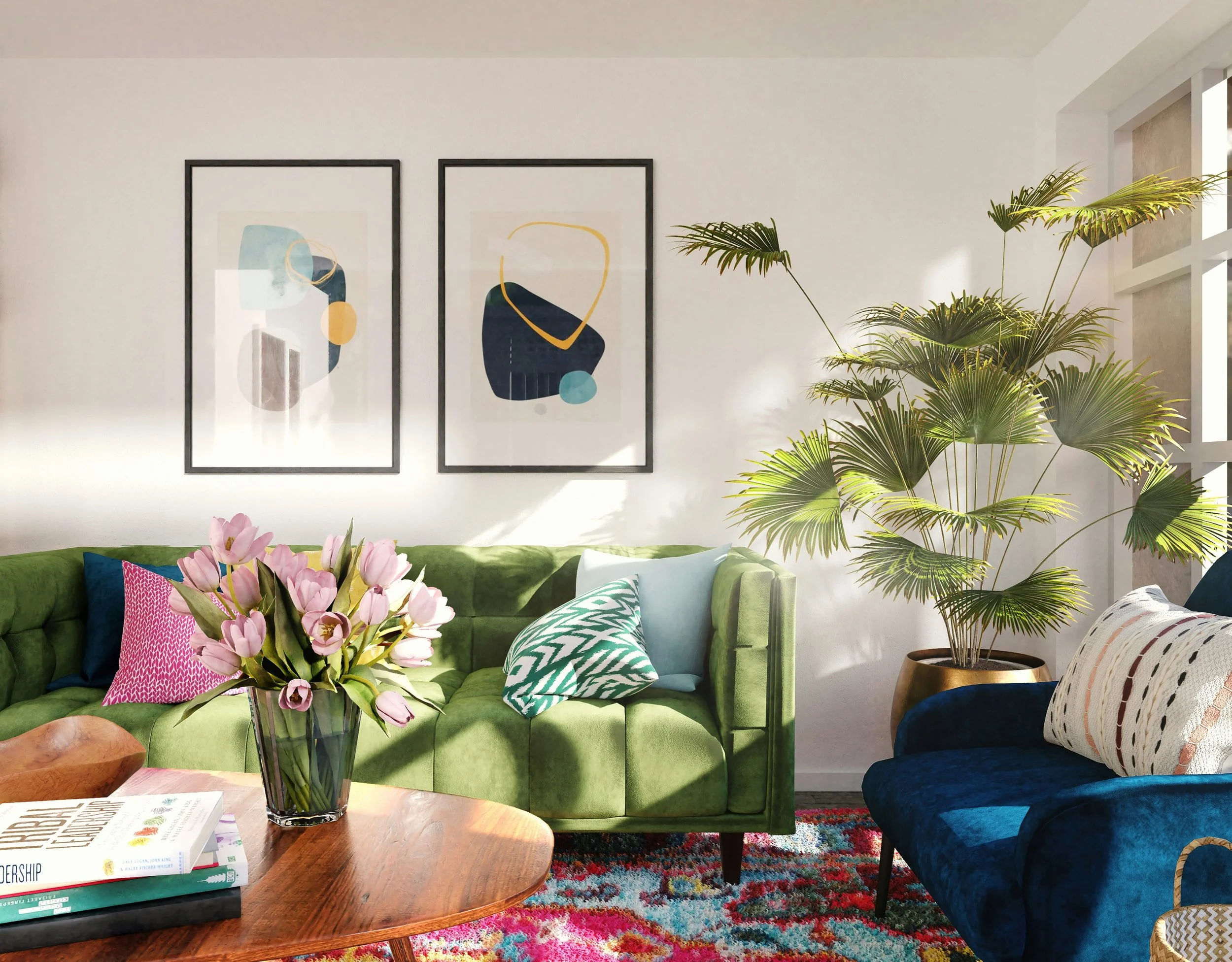
During the grey walls phase — which has all but ended now in 2026 — I saw it again and again with clients: warm-based homeowners living with cool-based greys in their homes. There are warm-based greys, but many women simply didn't know that, and they chose the wrong ones for their home's natural warmth. Thousands of homeowners did grey-and-white kitchens, following the trend rather than their home's true undertone, and today that look isn't what's trending anymore.
That's exactly why I don't recommend decorating by trends, by what your friends chose, or even by what your interior designer personally loves. I recommend decorating by what's true about your home and about you. Define the real you, and stick with it. We love things that look like ourselves — so when this is done correctly, you will absolutely love your rooms and your home.
What Makes a Home a Spring Home
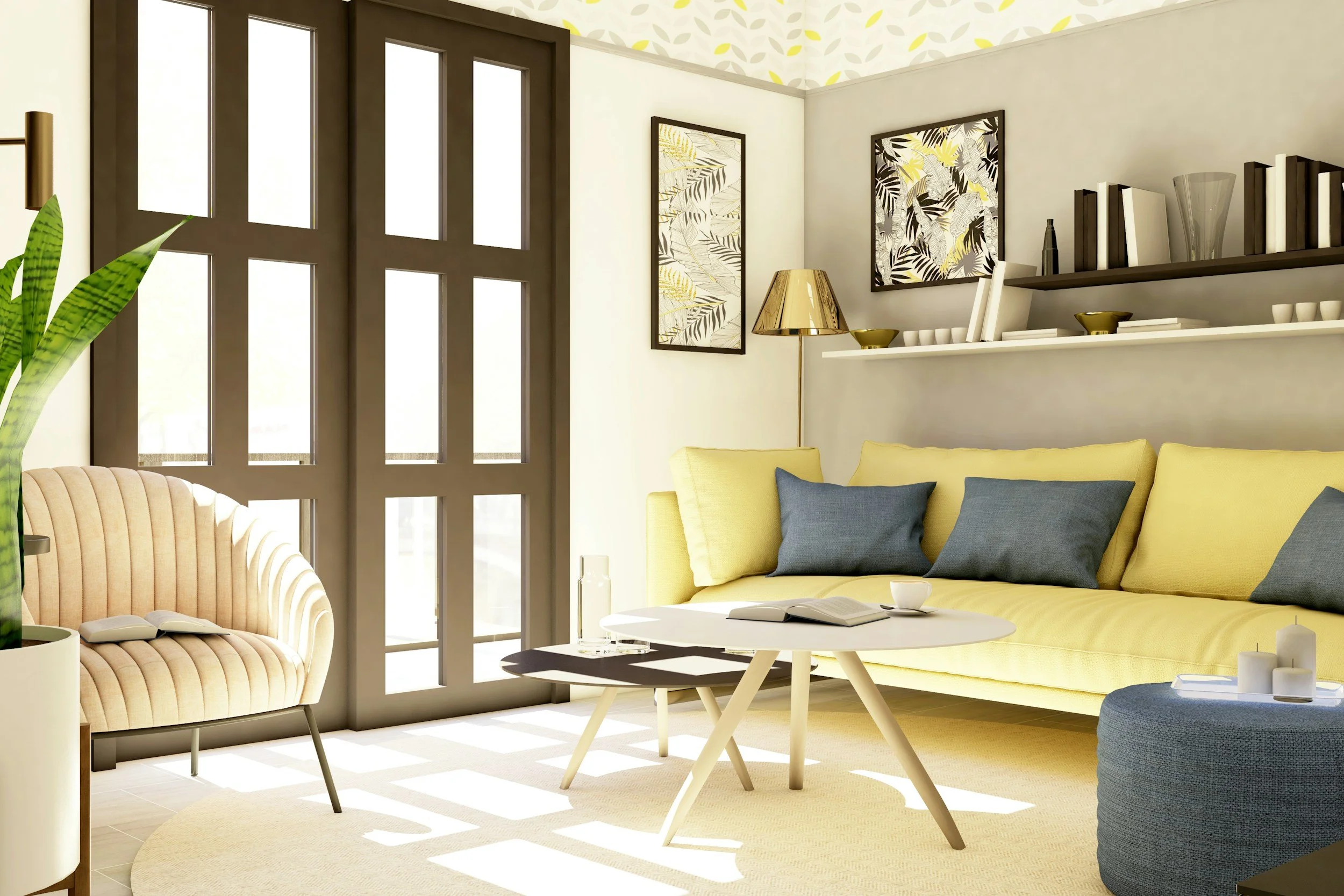
Just as with any seasonal palette, the starting point is your home's fixed elements — the things that can't easily be changed without a major renovation. Begin with your flooring: is it a light, honey-toned oak, a warm maple, or bamboo with a golden cast rather than an ashy or gray undertone? Next, look at your architecture. Spring homes often show up in cottage-style details, farmhouse touches, and interiors filled with generous natural light. Countertops with warm cream undertones and cabinetry with golden rather than cool gray tones are also signals that you're working with a Spring home.
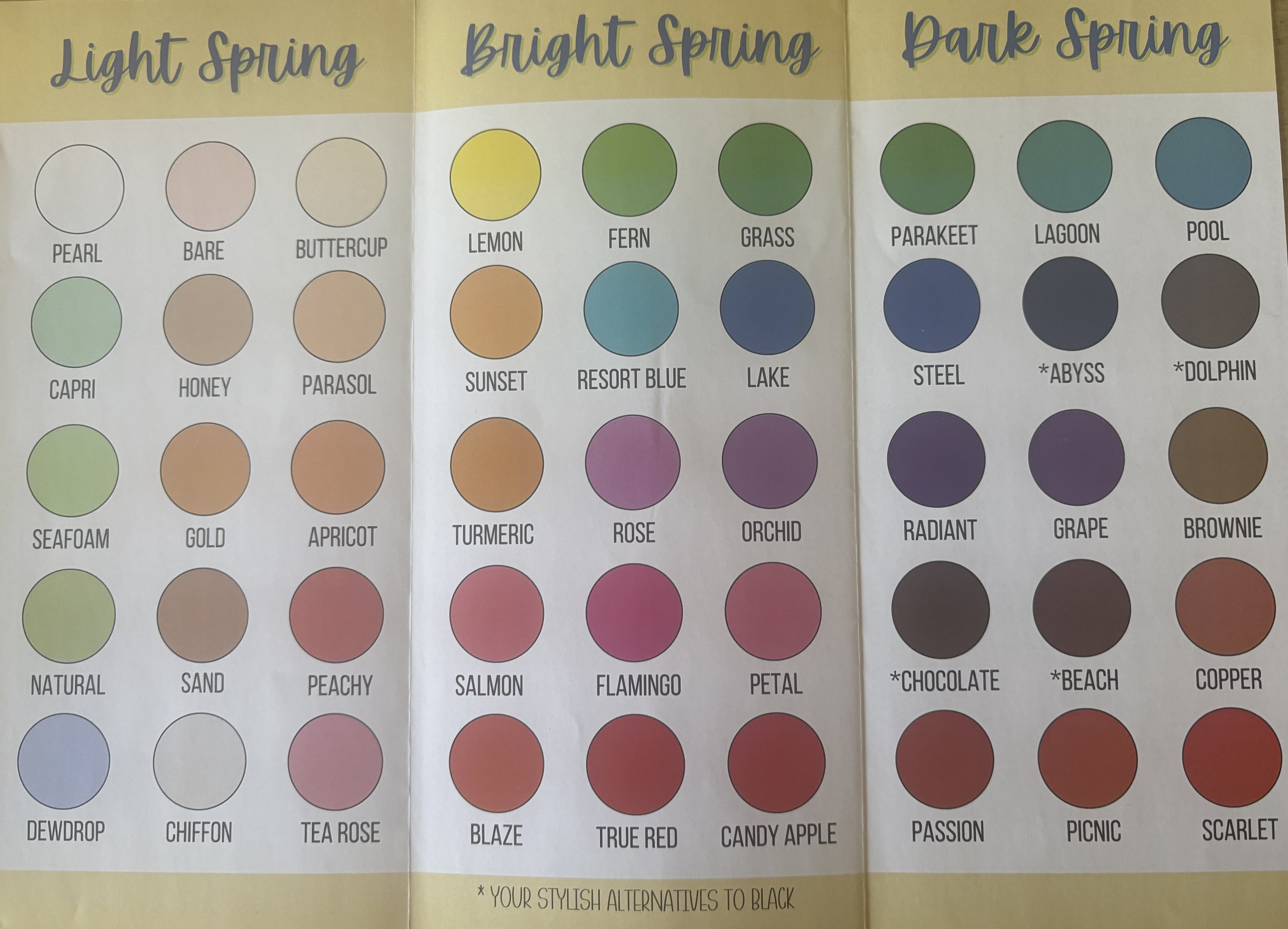
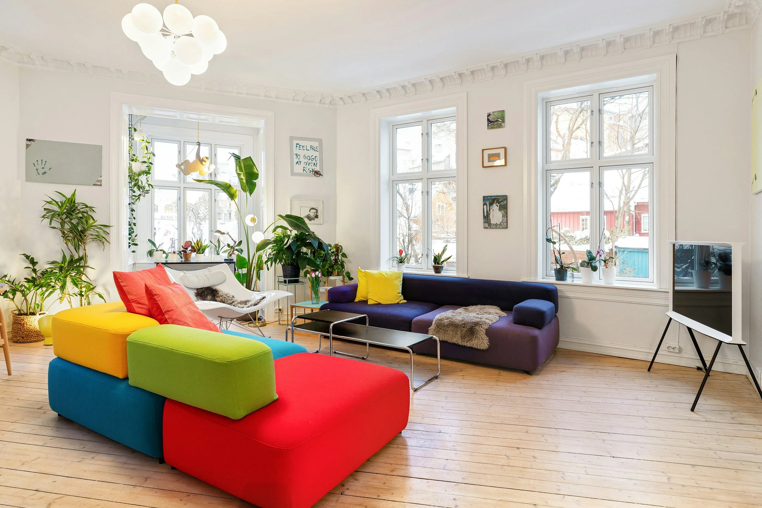
Where a Winter home thrives on stark black-and-white drama, a Spring home comes alive through an entirely different kind of contrast — the kind you find in a garden bursting into bloom. Picture coral, grass green, and sunny yellow layered together under a clear blue sky. Individually bold, together they don't compete with one another; they celebrate. This is a palette that genuinely rewards courage with color.
Metals should be warm and reflective. Polished gold and bright, shiny brass both belong here in their fullest, most unapologetic form — not the aged, oxidized brass associated with Autumn, but bright and fresh, catching light the way sunlight catches the surface of water. If your current hardware feels dull or overly cool-toned, even a modest swap to brighter brass fixtures on cabinetry or lighting can shift an entire kitchen or bathroom from flat to radiant.
Texture matters just as much. Spring homes favor light, natural textures: crisp cotton, linen, bamboo, and rattan. The goal is a sense of airiness, as though the room itself is breathing. Heavy, dense fabrics tend to weigh a Spring space down rather than complement it.
And pattern is where this season gets to have genuine fun. Medium-scale florals, simple stripes, polka dots, and cheerful geometric prints all belong in a Spring home. If you've ever stood in a fabric showroom and reached instinctively for the floral everyone else passed by, that instinct was correct — and it's worth trusting rather than talking yourself out of.
A Season That Mirrors a Deeper Renewal
There's a beautiful parallel between the Spring color palette and Song of Songs 2:11–12, which describes a season where barrenness gives way to blossoming and hiding gives way to singing. The Passion Translation renders it with striking imagery: the earth, soaked and renewed, bursting into bloom after a long, quiet winter. That is exactly the transformation a Spring home invites you into — moving out of restraint and into color, out of hesitation and into warmth. If you've spent seasons of your own life holding back — playing it safe, keeping things quiet and muted, whether in your home or in your heart — this verse is a gentle invitation that the season of hiding has passed, and the season for blossoming has arrived.
CONCLUSION
Trust the pull toward warmth.
Trust the instinct toward color.
If your floors are honey-toned, if your light is generous, if your heart leans joyful rather than dramatic — your home has been waiting for you to stop apologizing for its brightness and start decorating like you mean it.
FAQ
What if I love color but I'm not sure I'm actually a Spring?
Start with your fixed elements rather than your favorite color. A true Spring home shows warmth in its bones — honey-toned floors, warm cabinetry, cottage or farmhouse architectural details. If those elements feel warm rather than cool, you're very likely working with a Spring home, even if you've been decorating it with cooler tones out of habit or trend.
I already have grey in my home from the trend years — do I have to start over?
Not at all. If you're a Spring home working with cool-based grey, the fix is often about layering in warmth rather than ripping everything out — think warm brass hardware, honey-toned wood accents, and a few bursts of coral, green, or yellow. A skilled designer can often shift a room's entire feeling with strategic additions rather than a full renovation.
Can a Spring home still feel elegant, or is it always bold and busy?
Absolutely elegant. Boldness and elegance are not opposites in a Spring home — the elegance comes from confidence, not restraint. A Spring home dressed in soft pastels alone, like blush and buttercream, can feel just as sophisticated as one layered in bold coral and gold, as long as the palette reflects the home's true warm undertone instead of fighting it.
How do I bring romantic color moods into a Spring home without it feeling mismatched?
Choose the romantic mood that leans warm rather than cool. Classic Soft & Sweet, with its blush, cream, and buttercream tones, pairs naturally with a Spring home's warmth. Passionate & Bold, with raspberry and ruby balanced against ivory, also works beautifully. Layer those colors in through textiles like velvet, silk, or linen rather than paint alone, and the result will feel cohesive rather than themed.
Resource
Take the Interior Design Personality Quiz to understand your style, your priorities, and how to make decisions with confidence at shereedouglasbrock.com (scroll down to take the quiz)
Book a Beautiful Home Makeover Experience and transform your space in just a few hours—often using what you already own.