

Is Your Home an Autumn? How to Decorate with Rich, Layered Warmth

There is a specific kind of coziness that comes from a terracotta wall, an olive green sofa softened by years of use, and a mustard yellow throw folded over the arm — the visual equivalent of walking into a kitchen where something warm has been baking for hours.
If that image feels like coming home rather than a design choice, there is a strong chance your house belongs to what seasonal color analysis calls the Autumn palette, and understanding it may finally explain why certain warm, layered rooms have always felt more like you than anything sleek or minimal ever could.
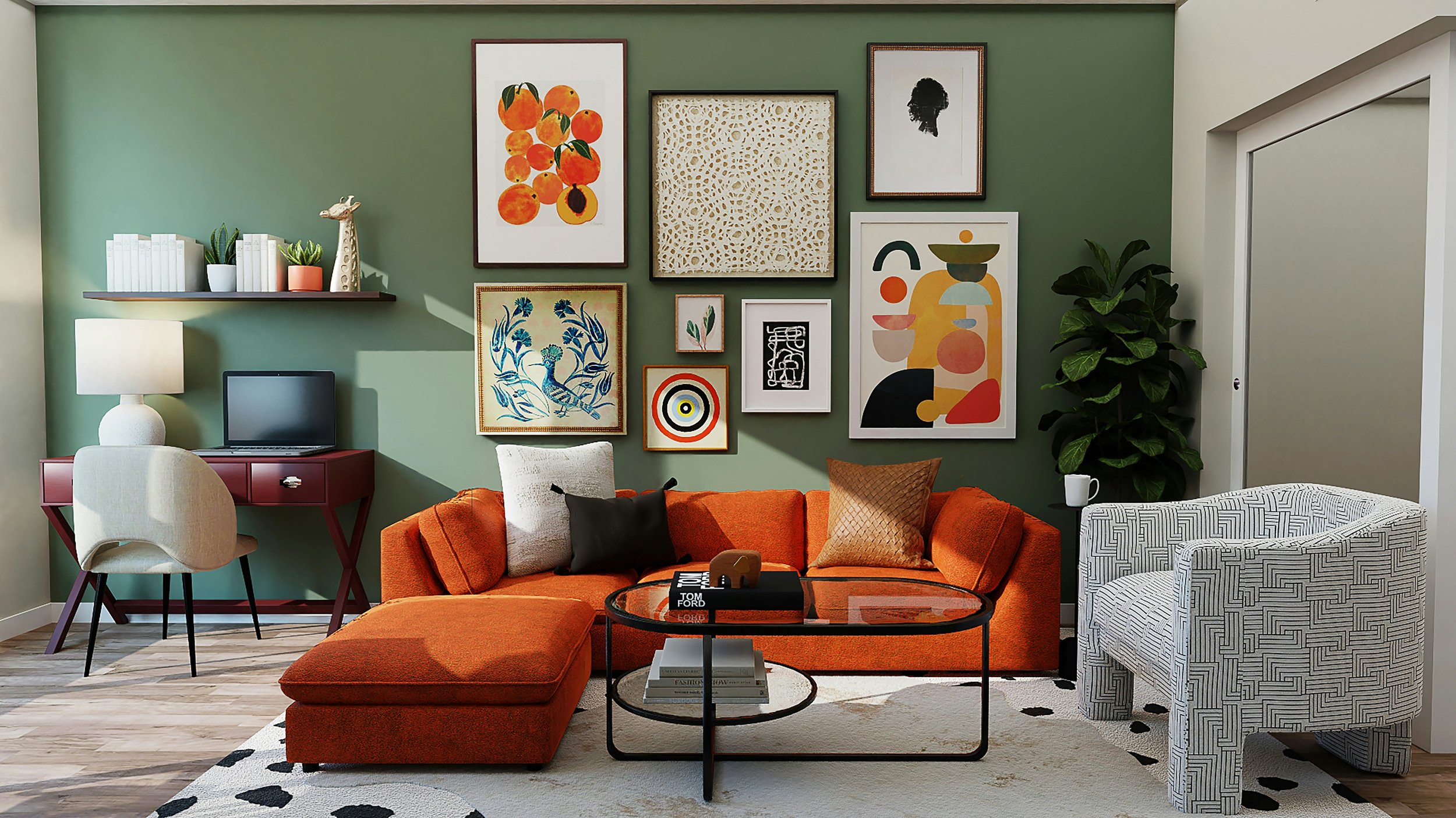
What Makes a Home an Autumn Home
As with every seasonal palette, the starting point is your home's fixed elements — the details that can't be swapped out without a significant renovation.
Begin with your flooring. Is it medium-to-dark wood in tones like cherry, walnut, or a rich, warm-toned oak, rather than something pale or ashy?
Next, consider your architecture. Autumn homes frequently show up in farmhouse-style interiors, homes with exposed wood beams, stone fireplaces, and richly finished built-in cabinetry. If your countertops or cabinetry carry deep, warm, muted undertones rather than bright or cool ones, your home is very likely an Autumn.
Rich, Medium Contrast: Autumn's Signature Move
Where a Summer home relies on low contrast and gentle tonal blending, an Autumn home thrives on rich, medium contrast built from layering deep, earthy colors together.
Picture a terracotta wall paired with an olive green sofa and a mustard-toned throw blanket. Each of those three colors is genuinely distinct from the others, yet they all share the same warm, muted undertone underneath — which is precisely why the combination reads as cozy and complex rather than chaotic or mismatched. This is a contrast with a soft landing rather than a sharp one, the visual equivalent of a warm hug instead of a bold statement.
Metals With History: Choosing an Autumn Finish
In an Autumn home, metal finishes should carry a sense of patina and history: aged brass, copper, and oil-rubbed bronze all belong here. These finishes catch light in a softer, more textured way than Spring's bright, polished gold, reinforcing the feeling of a space that has been lived in and loved rather than freshly unwrapped from a box.
If your current fixtures feel too shiny or too cool for the warmth of your Autumn home, swapping toward these aged, warm-toned metals can make an immediate difference.
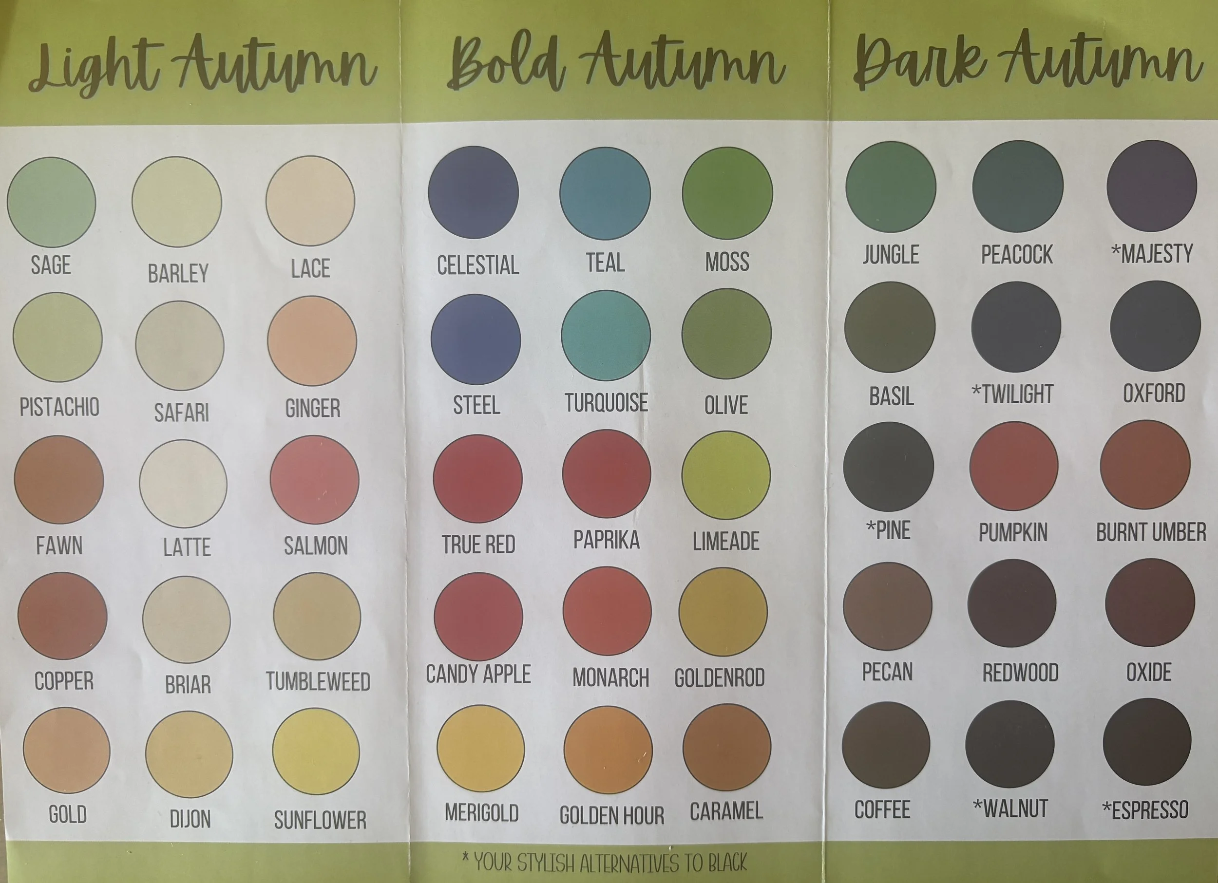
The Heart of an Autumn Room
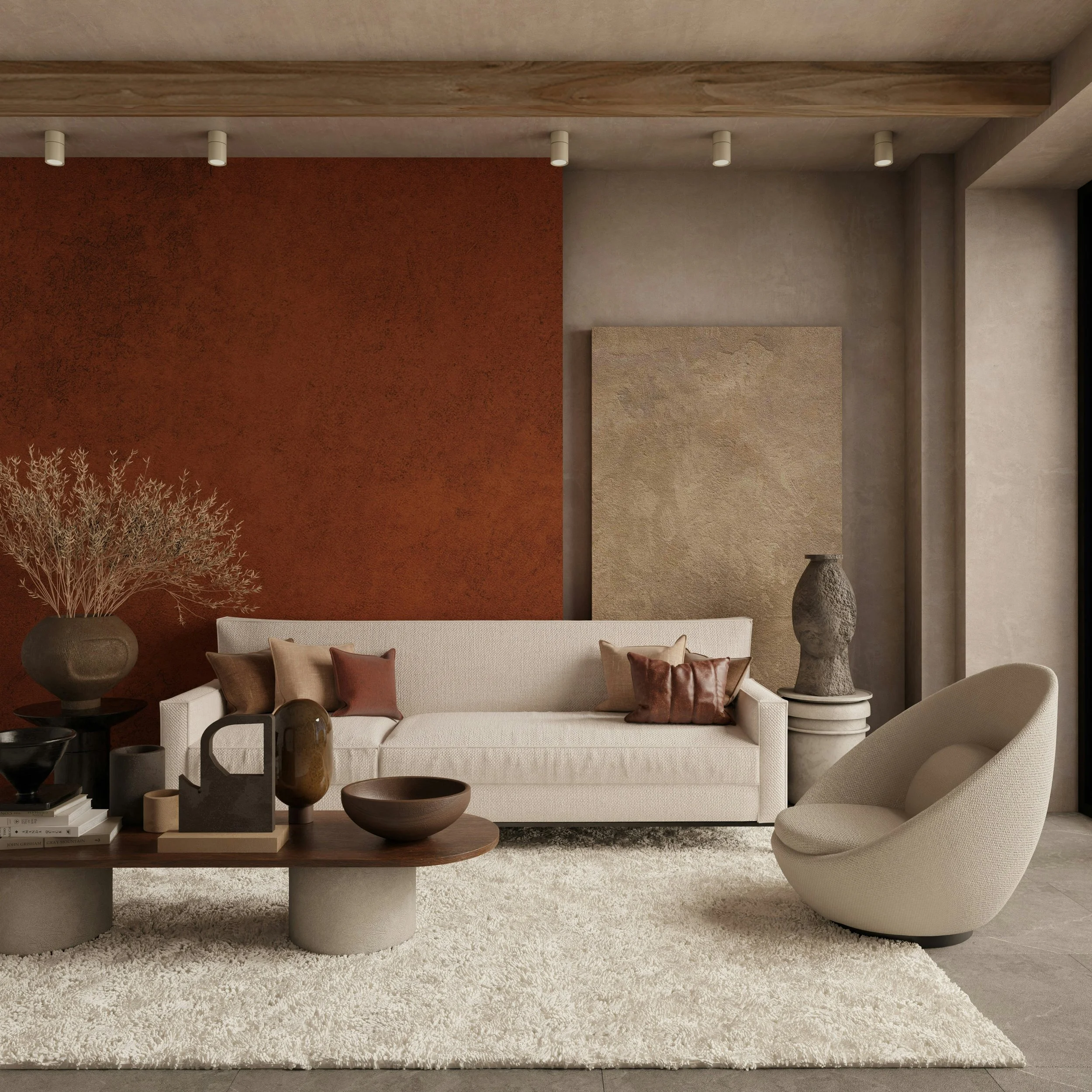
If Winter is defined by contrast and Summer by harmony, Autumn is defined by texture, and this is the one season that genuinely rewards abundance over restraint.
Chunky knits, raw wood, worn leather, wool, tweed, and jute all belong in an Autumn home, and the rule here is refreshingly simple: the more layers of natural texture, the better. A single throw blanket and one accent pillow will nearly always feel a little bare in a true Autumn room. This is the season where more is, genuinely, more.
Patterns Rooted in Nature
Pattern in an Autumn home should stay earthy and classic: plaid, paisley, herringbone, and botanical or other nature-inspired prints.
If you have ever reached instinctively for a plaid throw blanket or a botanical print rather than something sleek and modern, that instinct was your Autumn nature guiding you exactly where it should.
The Mistake Most Autumn Homeowners Make
The most common misstep in a true Autumn home is under-layering out of a fear that too much texture will read as cluttered. But Autumn is the one palette among all four seasons that was specifically built to hold abundance. A room with only a single throw and one pillow will almost always feel unfinished rather than restrained. This is the season to lean fully into layering, rather than holding back out of caution, better suited to a Winter or Summer space.
A Season That Points to Harvest
There's a fitting parallel between the Autumn palette and Psalm 65:11–12, which describes the earth crowned with the fruits of God's goodness, luxuriant pastures boasting of His bounty, and every hillside blossoming with joy. The Passion Translation captures this with vivid, almost tactile imagery — crowning, overflowing, blossoming abundance. Autumn, after all, is the season of harvest: the moment when months of quiet growing and tending finally become visible. If you've spent this year doing faithful, unseen work — in your home, your family, your business, your own heart — this verse is a promise worth holding onto. The harvest is coming, and your hillsides are about to blossom with joy too.
As this five-part series comes to a close, take a moment to notice which season pulled at you the most. Whether it was Winter's drama, Spring's brightness, Summer's calm, or Autumn's warmth, that pull was never random. It was your home — and perhaps your own heart — quietly telling you exactly what kind of beauty it was built to hold.
FAQ
How do I know if my home is an Autumn and not a Spring, since both are warm-toned?
Look at brightness and saturation rather than just warmth. A Spring home leans toward bright, clear colors like coral and sunny yellow with polished gold and brass, while an Autumn home leans toward deep, muted tones like terracotta and mustard, layered together with aged brass and copper.
I'm worried too much texture will make my Autumn room feel cluttered — how much is too much?
For a true Autumn home, more texture is almost always the right direction, not the risk. Rooms that have textures and layers of chunky knits, wool, leather, and jute together make the Autumn space feel complete.
Do all my metal finishes need to match in an Autumn home?
They don't need to match exactly, but they should share a similar aged, warm quality. Mixing aged brass, copper, or oil-rubbed bronze works beautifully in an Autumn space, since the shared patina ties them together even when the finishes vary slightly.
Resource
Take the Interior Design Personality Quiz to understand your style, your priorities, and how to make decisions with confidence at shereedouglasbrock.com (scroll down to take the quiz)
Book a Beautiful Home Makeover Experience and transform your space in just a few hours—often using what you already own.