

6 Steps to Pick Paint for Your Room and Home

Choosing paint is one of the most deceptively difficult decisions in home design.
At first glance, it seems simple.
You find a color you like.
You bring it home.
You apply it to the wall.
And yet, so often, the result doesn’t match what you imagined.
The color feels too dark… or too flat.
Too warm… or too cool.
Or simply “off” in a way that is difficult to explain.
This is where many homeowners begin to feel frustrated.
Because the expectation is that paint should be an easy decision.
But in reality, paint is one of the most influential layers in a home—and one that responds to everything around it.
PAINT IS THE STARTING POINT
One of the most common mistakes in design is beginning with paint.
It feels logical.
Walls are large, visible, and impactful.
But starting with paint often creates a ripple effect of misalignment.
Because paint is not meant to lead the design—it is meant to support it.
When chosen too early, it becomes something the rest of the room has to work around.
Instead of bringing the space together, it complicates every decision that follows.
HOW TO CHOOSE PAINT THE RIGHT WAY
1| Begin with the Feeling, Not the Color
The most successful spaces are designed from the inside out.
Before considering specific colors, it is essential to define how you want the room to feel.
Calm and serene.
Warm and inviting.
Refined and elevated.
This emotional clarity becomes the foundation for every design decision that follows.
Without it, paint becomes a guess rather than a solution.
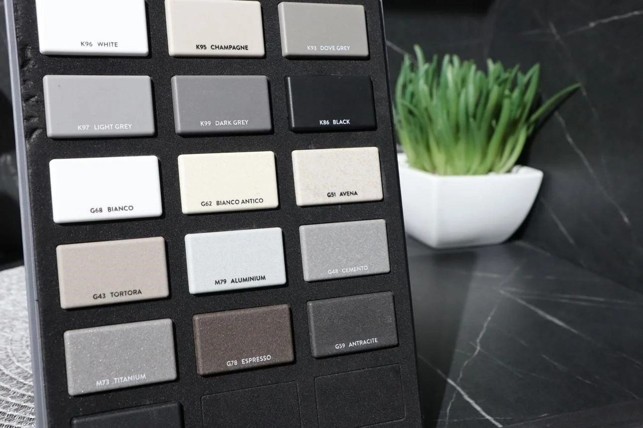
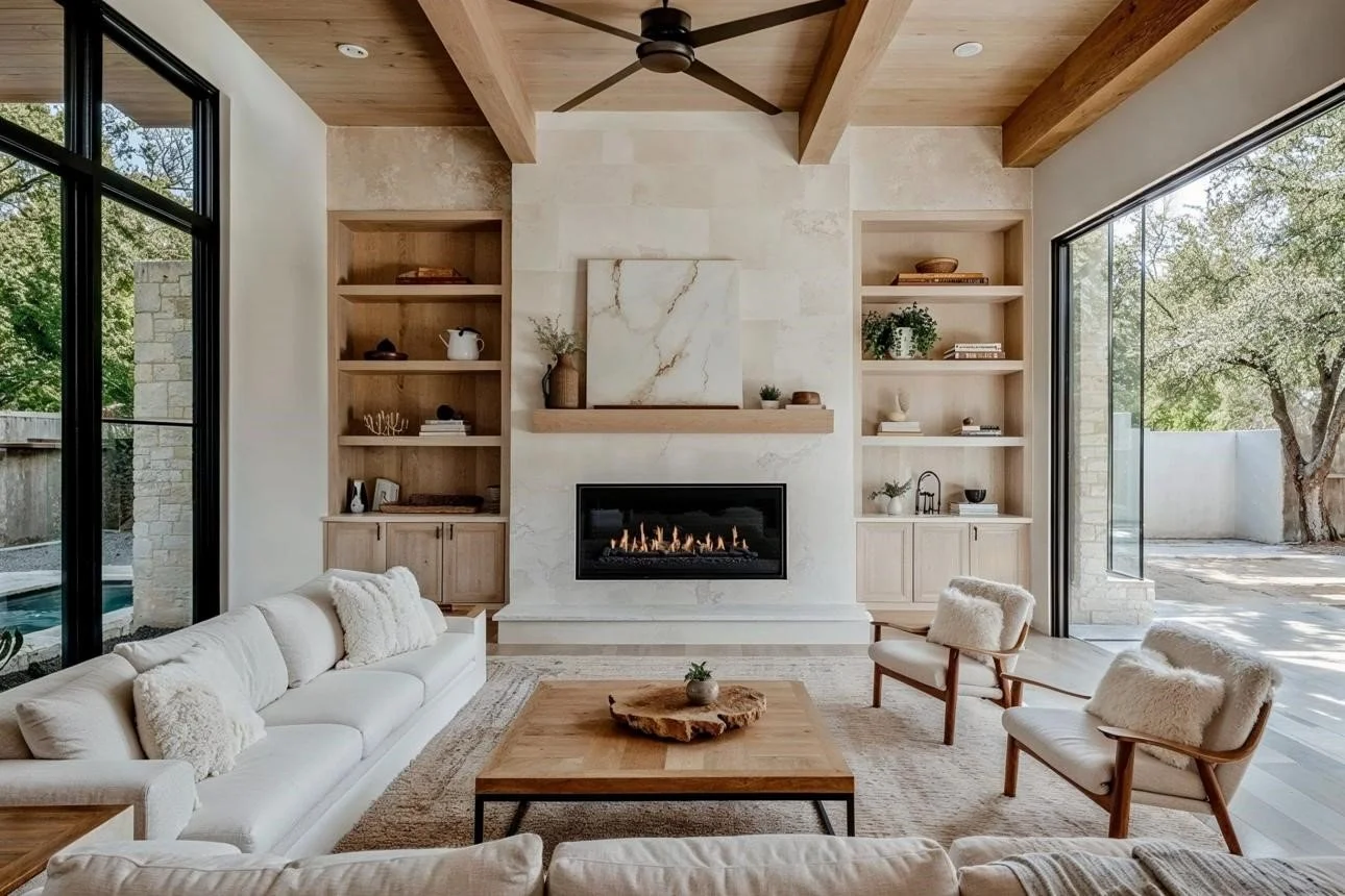
2| Let Fixed Elements Lead the Decision
Every room contains elements that are not easily changed.
Flooring.
Cabinetry.
Stone surfaces.
Key furnishings.
These elements already establish a palette.
Paint must relate to these tones, not compete with them.
When this relationship is respected, the space begins to feel cohesive.
When it is ignored, even beautiful colors can feel out of place.
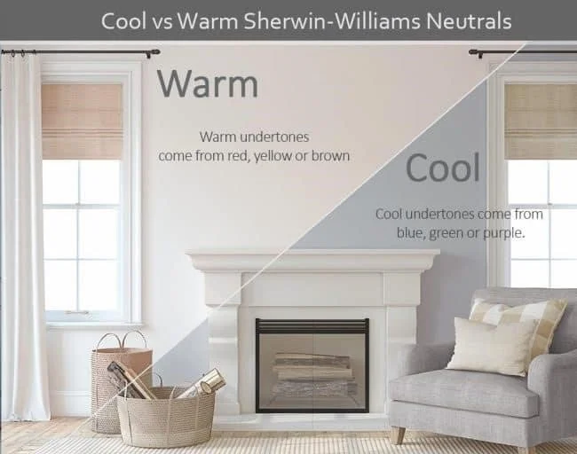
3| Recognize the Power of Undertones
Undertones are often the hidden reason a color does or does not work.
Two shades of gray may appear similar at first glance…
but one may carry a cool blue undertone, while the other leans warm.
These subtle differences become more pronounced once the color is applied to a larger surface.
Understanding undertones allows you to select colors that harmonize with your home rather than clash with it.
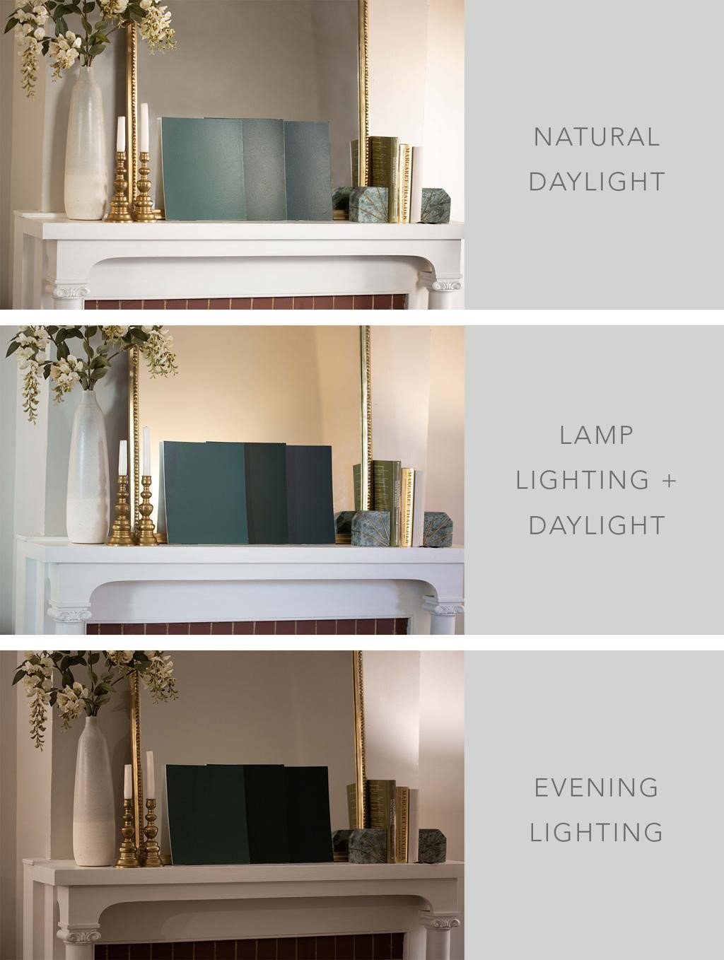
4| Experience the Color in Real Conditions
Paint is not static.
It changes throughout the day as light shifts.
Natural light reveals one version of the color.
Artificial light reveals another.
Testing colors directly in your space allows you to observe these changes.
It gives you a complete understanding of how the color will live in your home—not just how it appears on a sample.
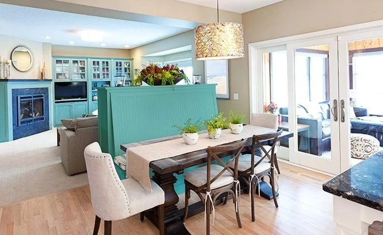
5| Create Continuity Throughout the Home
A well-designed home feels connected.
Colors flow naturally from one space to another.
This does not mean every room must be the same.
It means each space relates to the next in a thoughtful, intentional way.
When color transitions feel abrupt, the home feels disjointed.
When they are harmonious, the home feels calm and unified.
6| Refine the Palette for a More Elevated Result
Simplicity is often what creates the most sophisticated spaces.
A limited, well-considered palette allows each color to feel purposeful.
It reduces visual noise and enhances the overall sense of calm.
Instead of adding more variety, refining your choices often leads to a more elevated outcome.

WHEN COLOR FEELS EFFORTLESS
When paint is chosen in the right order, something shifts.
The home begins to feel cohesive.
Decisions become easier.
The space feels aligned.
There is no sense of working around the design.
Everything simply fits.
WHY PAINT GOES WRONG
When paint does not feel right, it is often due to:
Choosing color before selecting key elements.
Ignoring undertones.
Testing too small of a sample.
Selecting colors in isolation.
Overcomplicating the palette.
These are not major mistakes, but they create a larger sense of imbalance within the home.
Conclusion
Choosing paint does not have to feel overwhelming.
It becomes simple when approached in the right order.
Because paint is not about finding the perfect color.
It is about creating a relationship between everything in your home.
And when that relationship is clear, the result is a space that feels effortless, elevated, and complete.
FAQ
Why does my paint color look so different on the wall than it did on the sample chip?
Paint is incredibly responsive to light, scale, and surroundings. A small chip reads very differently from a full wall because the color intensifies as the surface area grows. Natural and artificial lighting also shift how the color reads throughout the day — which is why testing a large swatch directly in your space is one of the most important steps before committing.
Should I choose my paint color first when designing a room?
This is one of the most common mistakes homeowners make. Paint should actually be one of the last decisions, not the first. Your fixed elements — flooring, cabinetry, stone, and key furnishings — already establish a palette. Paint is meant to support and complete those elements, not compete with them.
What are undertones, and why do they matter so much?
Undertones are the subtle hues hiding beneath the surface of a color. A white might lean pink, a gray might lean blue, and a beige might lean green — and you may not notice until it's on your wall. Understanding undertones helps you choose colors that harmonize with everything else in your home rather than quietly clash with it.
How do I make my home feel cohesive when different rooms have different colors?
Cohesion doesn't mean every room is the same color — it means the colors relate to one another intentionally. The goal is a palette that flows naturally from space to space, so transitions feel calm and connected rather than abrupt. A simple, refined palette across the home creates that sense of unity without feeling monotonous.
How do I know if my color palette is too complicated?
If you find yourself feeling unsettled or overwhelmed when looking at your space, the palette may have too much variety. Sophisticated, elevated interiors are almost always built on restraint — fewer colors, chosen with intention. Simplifying your palette often does more for the overall feel of a home than adding more.
Resource
Take the Interior Design Personality Quiz to understand your style, your priorities, and how to make decisions with confidence at shereedouglasbrock.com (scroll down to take the quiz)
Book a Beautiful Home Makeover Experience and transform your space in just a few hours—often using what you already own.